




matt johnson

spot codes
Google Pay
scroll to see more
Opportunity
QR codes remain the dominant method of contactless payment worldwide. Google Pay supported fast, secure payments via India's interoperable QR standard, but the app had far more to offer users in an in-store context. With a third-party developer platform already built, Google needed a new market signal that didn't just say "Pay with Google Pay" but "do {X} with {Brand} on Google Pay."
DELIVERABLE
A proprietary visual code that has functional and performance parity with QR and is capable of being (a) Google branded, (b) third-party branded, and (c) the central character in a B2B and consumer story about building a true super app.
CONTRIBUTION
• Designed, specified, and led creative framing around the final solution
• Validated the standard against engineering benchmarks
• Supported adoption and rollout with early partners
DetAils
Company
:
Product
:
Google Pay
Role
:
Product UX Lead
Timeframe
:
2019 Q2 – Q3
Auditing External Players
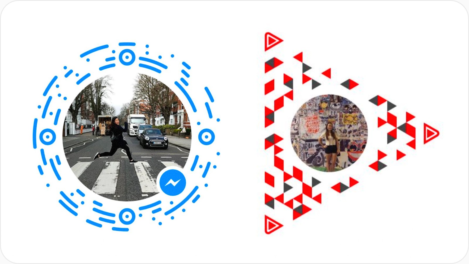
Proprietary QR codes aren't new. Social networks and media platforms have long used branded codes as hero CTAs. Before diving into detailed design, I ran a quick audit of relevant market examples still in mainstream memory. Less about inspiration, more about two things: understanding how far we could technically stray from standard QR formatting, and ensuring our solution was visually differentiated from existing players.
Connecting Dots Internally
Google's scale means redundant efforts are inevitable. I ran a parallel internal audit to surface any existing work, technologically or design-wise, worth building on. It paid off: past teams' attempts (and failures) gave us hard-won context, and the audit surfaced the underlying technical framework that ultimately powered our solution.
Insights > Success Criteria
Both internal and external audits allowed us to synthesize some key insights into criteria that framed our solution-space and helped drive what was working and was not as we got into development:
Ownership/Attribution at the Core
Who is the sponsor for this featureset behind the code?
Google Pay places strong equity in the avatar. The user or merchant's identity should be the focal point. Our code should adorn it, not be the dominant visual element.

Affords Scannability
How will users intuit this is a scannable code?
Users need to understand, however implicitly, that this code has a function: it's a shorthand to a commerce experience on Google Pay that requires a scan via in-app or native camera.

Familiar from 15 Meters
How will users distinguish this code from a distance?
In noisy, high-stimulus environments, uninformed users should immediately read this as associated to Google Pay. Informed users should be able to identify and act on it quickly.

Performant at 8 Meters
What's required to ensure it works in most contexts?
The code and its encoding/decoding tech must be robust enough to perform in low-light, low-contrast, and otherwise non-ideal conditions – with sufficient orientation, alignment, and error correction built in.
Iterative Studies
Armed with only preliminary payload requirements, the first pass was exploratory: formats that felt Google, were distinctive at scale, and kept the sponsor's identity front and center.
Technical Validations

In parallel, a series of underlying grid studies benchmarked the decoding library and tested how density, scale, offsets, and color-contrast affected viability across real-world conditions.
Design Candidates
A half-dozen candidates emerged as technically viable and creatively ownable. Each was presented to leadership and key stakeholders for evaluation before a single direction was selected and carried into refinement, validation, and specification.
Code Grid & Design
Despite more visually distinctive candidates in the running, the clean dot array was the right thing to ship. Simplicity de-risked the hardest problems (performance, production, printing, trademarks, etc.) and gave the solution the best shot at longevity in the market and among future Google products that bring payments along for the ride.
Strength: Flexibility by Default
A technically and visually neutral foundation that can evolve into more distinct shapes and arrangements as adoption grows and usage patterns emerge.
Strength: Reinforces Product Motif
Unopinionated enough to stay out of the way, but deliberately carries forward Google Pay's most prominent abstract motif: the chathead/avatar.
Strength: Color as Expression
By minimizing variable elements (shape, scale, orientation), color becomes the primary lever for personal and brand expression across entities.
Modules / Payload
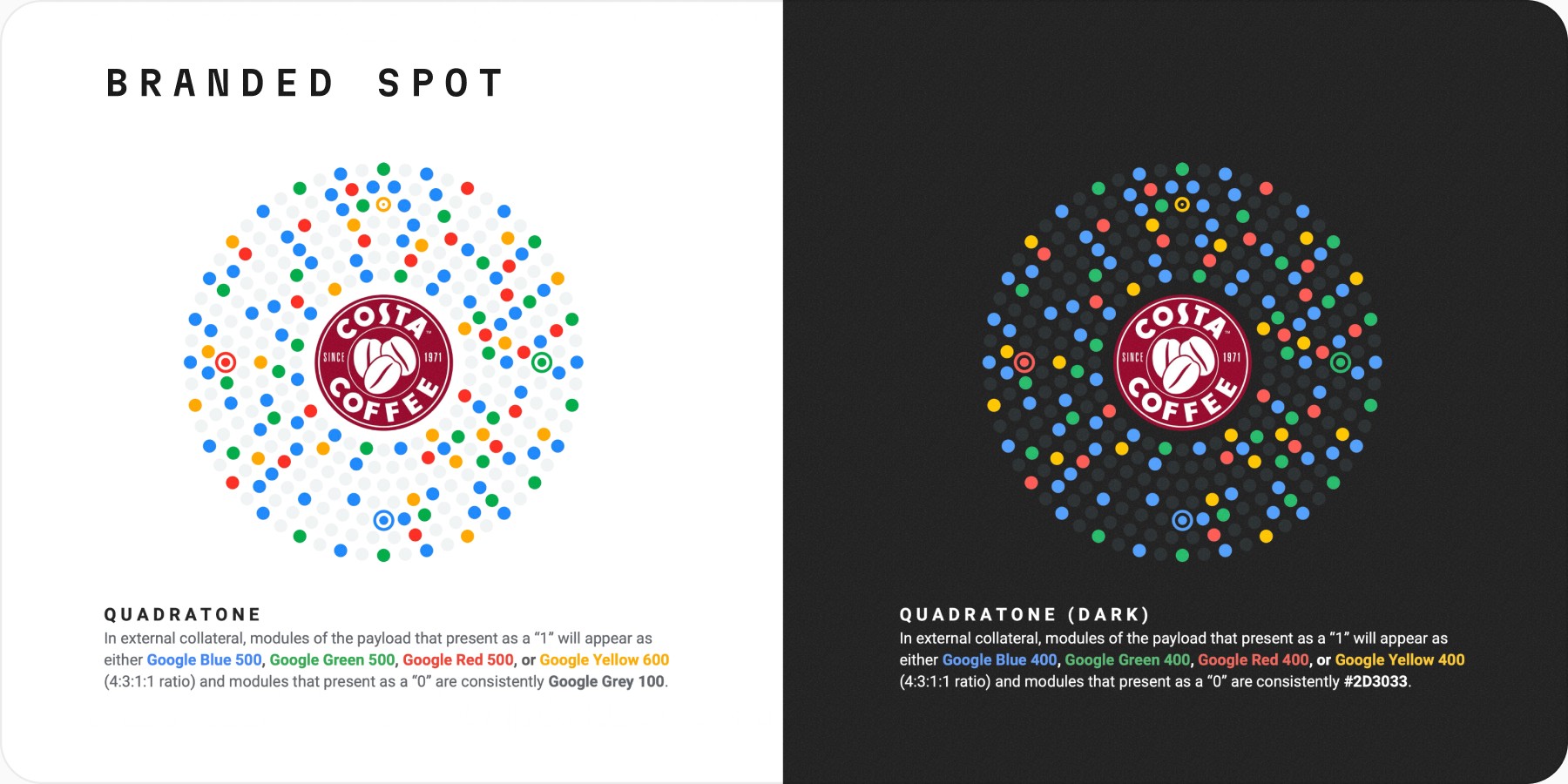
A concentric grid of 12 rings spaced apart by margin [x] form the footprint of the code (r=12x). 308 modules of size [3/4x] are arranged radially along 7 rings from the fifth outward ring (5x) to the eleventh (11x). The outermost ring consists of 56 modules with each consecutive ring inward containing 4 fewer modules than it’s outer neighbor.
Markers
Three position markers and a single alignment marker appear along the 9th ring outward (9x) each presented 90º away from the other to form a series of isosceles triangles. Each position marker consists of a center module [x] and outer ring where the ratio between the outer ring’s thickness, margin, and module is 1:1:3:1:1. The alignment marker (top) maintains a respective ratio of 1:1:1:1:1.
Avatar
The avatar of the entity occupies the first 4 rings of the footprint (4x) totalling to ⅓ of the overall size of the code.
Usage & Extensibility
With design locked and specified, the final exercise was establishing a system to distinguish branded (psuedo first-party), third-party, and peer-to-peer experiences. Less critical for end-users, this was about setting a scale pattern before it actually scaled and codifying the contractual and data-privacy distinctions between experience types.
We landed on a simple color allocation as the launch treatment: keep the rules legible, de-risk contrast issues, and leave room to grow. Post-launch cycles were earmarked for more expressive color use and animated variants to reinforce trust and security in digital contexts.
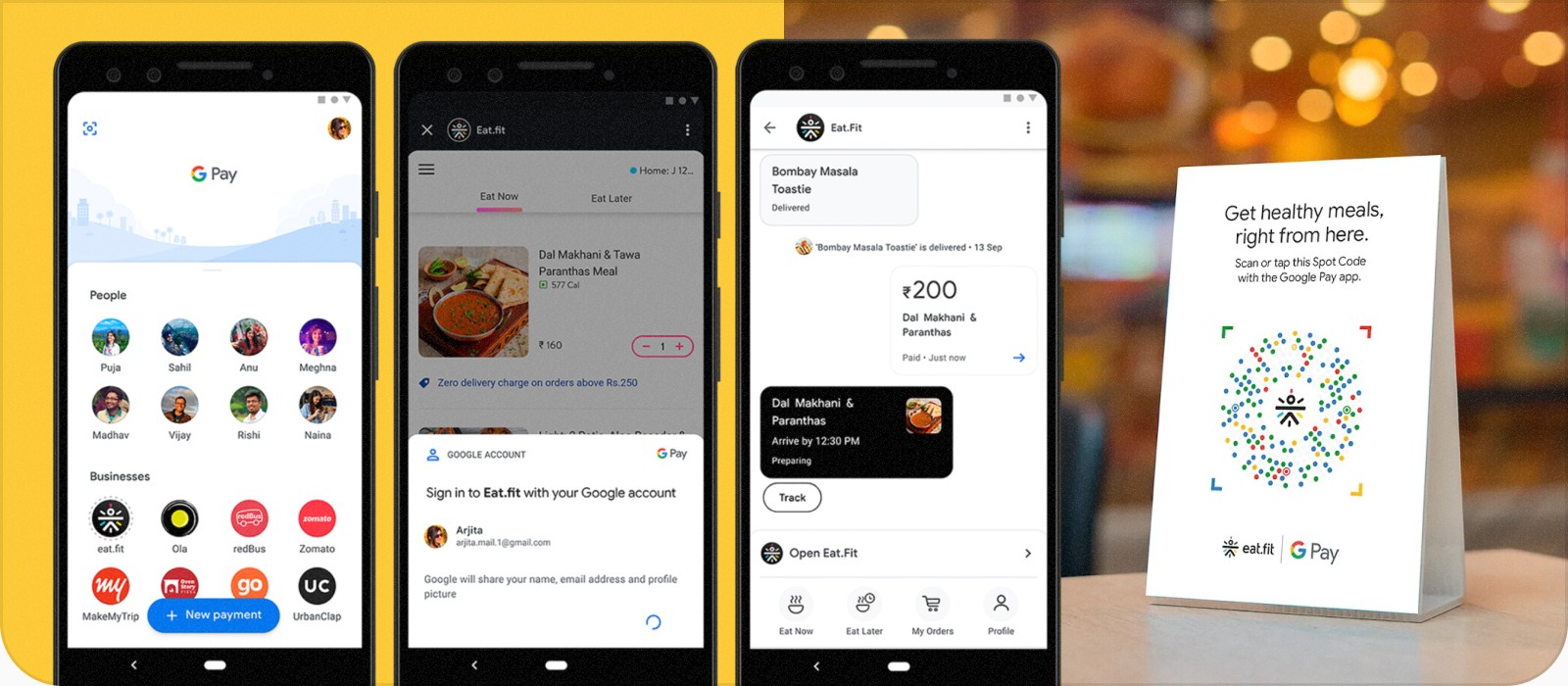
Through direct collaboration with our VP of Consumer Payments and internal marketing partners, the design was coined the "Spot Code," a name that pulled double duty. It nodded to the dots comprising the code itself and the destination users land when they scan it: a brand's hosted experience inside Google Pay.
The name then naturally extended into the broader "Spot Platform" initiative. Consumers could explore "Google Pay Spots" while brands could claim their own "{Brand} Spot on Google Pay." For partners, the framing was pitch-perfect: a piece of real estate inside our app to build, deliver, and convert right where their customers were already ready to act.
Launching the Spot Platform
At Google's annual Google for India 2019, the Spot Platform was announced with early-access partner experiences already live and the full platform open to developers. The event featured Google Pay staff wearing scannable Spot Code adorned merch along with a large hanging installation of a physical Spot Code mobile that hung in front of the Google Pay section of the event.
Dozens of brands went on to develop fully-integrated product experiences with the Spot Platform while hundreds of other brands offered extended functionality through light-touch integrations with existing web functionality.


REFLECTIONS
The Spot Code hit a sweet spot for me: graphic craft, brand, and tech all tangled together in exactly the way I enjoy working. Tight constraints make for a puzzle-like creative space, and the solution that emerged felt true to the effort internally and externally. A genuine win for close collaboration between UX, engineering, and marketing.
WINS
+ Met UX, technical, and marketing criteria across the board (personalization aside)
+ The design gave the entire initiative a stronger, more cohesive narrative for every party in the ecosystem
+ Made a lasting public impression at launch and a meaningful boost to product, brand, and Google Pay's identity as a commerce platform
FAILS
– Departure from traditional QR was significant enough that scannability was lost on less tech-savvy users
– Graphically elegant, but color alone carries too much of the Google / Google Pay brand equity
DIFFICULTY
High-visibility, VP-driven project with real organizational pressure
Tight constraints across both digital and physical contexts
Iterating on the underlying design while simultaneously validating performance was costly