




matt johnson

brand personality
Arta Finance
scroll to see more
Opportunity
Bringing senior design talent into a startup early means having runway before Engineering's foundational work catches up. At Arta, that lead time gave me the privilege to build the brand from first principles, then outward from the product.
DELIVERABLE
A codified foundation of core values, identity, and visual language that defined how Arta showed up in the world.
CONTRIBUTION
• Owned end-to-end process and deliverables for defining Arta's identity
• Drove sprints, critiques, and stimulus that forced alignment from founders
• Built artifacts that propagated the identity internally and to external contractors & agencies
DetAils
Before the Brand
When Arta formed, it's 8 co-founders (I know, right!?) each brought essential C-suite experience in areas the company would need to grow into. Aligned on the opportunity, much still remained undefined about the values the company wanted to rally around internally and express, however implicitly, to the market and users.
Before any tangible brand artifacts could exist, the first step was getting all 8 in a room to co-author Arta's values and personality.
The Values We'd Rally Around
What we do
We combine deep tech and high finance to empower more people to build the future they want
WHY WE DO IT
We believe better access to financial intelligence creates transformative progress for individuals, communities, and economies
WHO WE ARE
We are a group of product builders, machine learning researchers, and finance professionals uniting both passion & experience to build a company that will make our families proud
WHO WE ARE BUILDING FOR
We’re building this for rising affluents who are shaping the curve of technological and cultural change at a global scale – anyone who is building the future for all of us.
WHAT WE ARE BUILDING
Arta is creating a digital family office that empowers our members to deploy sophisticated financial strategies that have been out of reach – until now. We enable intelligent investing in public and alternative investments and open access to financial products that can help advance their unique life goals.
Shaping A Personality
Founding leadership came with deep business expertise and very little practice in the subjective. Discussing how values extend into voice and personality was new territory for most.
To break through, I co-led an exercise with Arta's Head of Marketing using fictional characters as stimulus to pin down "who Arta is" and "who Arta is not." The exercise surfaced themes and traits that we shaped into Arta's own unique personality descriptors.

Endearingly Nerdy
We go deep. Sometimes a bit too deep. We’re all about exploring the Greeks and geeking out on why risk-adjusted returns matter more than generating alpha.
We can talk shop all day long, but stop us if we get too excited.
Relentlessly Optimistic
We look forward a lot. And we think the world can only get better when we apply our collective care, skills, and ambitions towards it.
We’re upbeat about the possibilities that technology brings to the world of finance, and excited about how we can transform the experience for people everywhere.
Solutions-Oriented
We’re a workshop, not a museum. We don’t just present information, we turn it into practical, useful insights that are ready to apply.
We make people feel less stressed about their financial decisions simply because their information is presented clearly and it’s simple to take the next step.
Ally, Partner, and Coach
We’ve always got your back. We don’t push stuff that you don’t want or isn’t right for you. And we take our fiduciary responsibility far too seriously.
We earn your trust by being transparent about what we do and how we make money. We’ll abstract the complexity away but give you back the controls when you want to drive.
Efficient, Responsible Work Ethic
We measure twice, cut once. We place utmost priority in the privacy and security of our member’s data. We’re committed to upholding world-class security and fiduciary standards, that go beyond what’s expected.
But securing the foundation of our systems doesn’t mean subjecting our members to more cumbersome processes. Where we see inefficiencies, we’ll streamline them and focus your time and attention on what’s important.
Tuning Our Value Prop

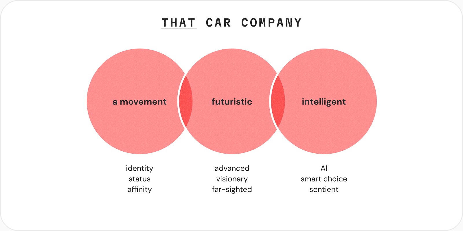
Another exercise I brought in from the agency playbook: using the core value propositions of well-established products to sharpen our own positioning in the field.
What followed mapped three layers – the existing landscape we aimed to disrupt, adjacent verticals with aspirational overlap, and the far-too-wide spread of qualities surfaced from each founder's take on the company. The last one made the case plainly: without focus, the message is diluted.
Surveying the Landscape
Moving from values to visual, we ran an audit of brand expression across our competitive and adjecent spaces. Three goals:
Align on the competitors and peers users would naturally position us against
Stimulate discussion around what works, what doesn't, and where we wanted to land vs. steer clear of
Ground founders in the vocabulary of brand – priming them to assess our own work more fluently later

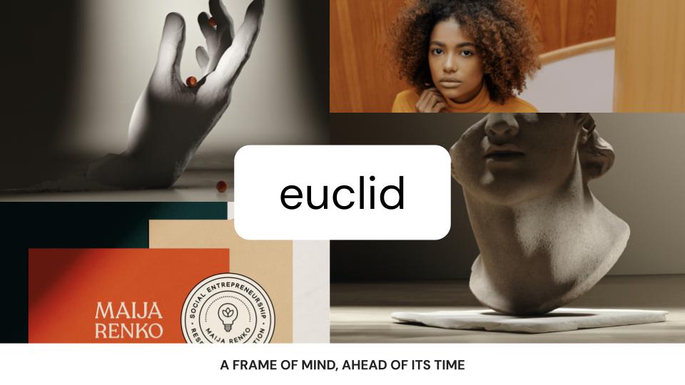
Seeking Good Vibes

The humble moodboard is canonical, unavoidable, and still one of the most effective alignment tools in the process. My take paired found visuals with an overarching name and a tagline that tied each creative concept back to Arta's story and mission. The goal was to draw an expansive aesthetic map for stakeholders to navigate, react to, and ultimately narrow from.





Narrowing the Palette
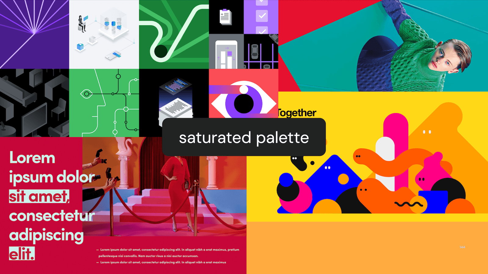
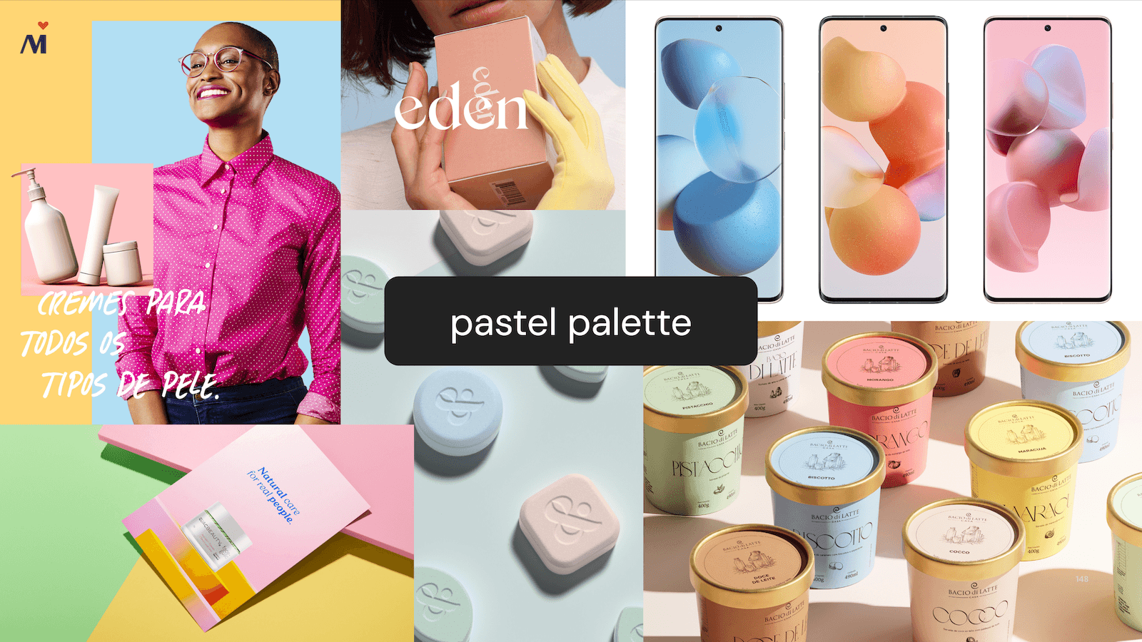
Color is notoriously hard to discuss in the abstract. I assembled a separate set of stimulus to isolate it from the broader moodboard conversation, surfacing founders' subjective biases and priming them for the visual iterations ahead.





Pairing Typography
Display type got the same isolated treatment. With Rotunda by Tipotype already established as our workhorse, the exercise focused on how display and supporting styles paired against it – eliminating what felt off and reinforcing what fit.


Cherry Picked Directives
As the founding group reacted to each exercise, four visual themes emerged to take into design iteration with near-unanimous appeal:

Saturated Color
Bright, vibrant color with real depth felt fresh against the muted tones of institutional finance. Embracing the full spectrum rather than a dominant hue also felt congruous with the breadth of what we were building.

Fractal Forms
A visual language that turned intentional chaos into something generative. The appeal was in the potential: procedural creation, infinite iterations, and a natural bridge to personalization or data-driven expression.

Tactile Treatments
Stippled texture as a counterweight to the heavy gradient washes dominating tech and crypto. A signal of craft and attention to detail, both values we wanted embedded in the brand from the start.

High Potential Energy
Compositional dynamism and deliberate use of masking and overlap gave the group something to react to. A recurring note: these treatments felt like they were begging to be put into motion.
Framing for Iteration

Before presenting concepts to the founding team, I grounded the phase of work itself with an apt metaphor. Think high-fashion on the runway. Each concept is polarized to distinction and dialed to eleven – not made to be worn everyday, but purpose-built to establish direction and evoke a gut feeling. Then, established shared evaluation criteria so the work could be assessed objectively:
01
Reach
Communicate our mission, value, and competency effectively
02
Impact
Resonates and evolves with the relationship we have with our initial and next-wave audience
03
Distinction
Differentiate our product and company in the financial space
04
Scalability
Provide sufficient runway for iteration & evolution alongside the product
05
Production
Does not demand considerable expertise or resources to produce
Concept A: Vertex
Angular gradients create (1) a strong focal point representing our unique perspectives on investing and the market and (2) an abstract sense of spatial depth, creating and 'environment' for focus and trust.
A dot matrix pattern can help reinforce our focus on craft as product builders while introducing animation or interactivity could represent the dynamism of our technology.
Tech-Forward
Intellectual
Precise
Intense


GLOBAL MOTIF
Living Dot Matrix
SIGNATURE VISUAL
Angular Gradient
SiGNATURE MOTION
Gradient Angle Sweep
Concept B: Atomic
Dynamic & colorful compositions of primitive shapes reinforce the nature in which (1) our features combine to form a new category, (2) we unite a family’s holistic financial interests, (3) we create connections, and (4) we draw on various strategies to create scalar/multiplier effects.
Tactile
Composed
Upbeat
Unifiying


GLOBAL MOTIF
Stippled Texture
SIGNATURE VISUAL
Primitive Geometry
SiGNATURE MOTION
Intentional Parallax
Concept C: Litho
Tasteful combinations of unique typography and distinct graphic patterns create a refined and editorial brand where copy is king – the visuals form the feeling rather than the message.
Boutique
Striking
Modern
Editorial


GLOBAL MOTIF
Subtle Repeated Patterns
SIGNATURE VISUAL
High-Contrast Type
SiGNATURE MOTION
Color & Copy
Refining the Essentials
With the founding group rallied around Vertex (Concept A) as our guiding direction, the final phase was locking in the atomic elements that would need to hold up consistently across every touchpoint (brandmarks, typography, color, etc). Each got dedicated design attention before coming back to the group for final review and sign-off.
LOGOTYPE

LOGOMARK

TYPOGRAPHY

CoLOR SYSTEM

Product & Marketing in Parallel

Everything up to this point lived in the abstract — invaluable for building shared interpretation, but still safely contained in deckware. The real pressure testing would happen on priority surfaces that would actually reach our target audience: the launch candidate for our product and the website we'd use to acquire our early adopters and press.
This is where early, experienced, founding design pays off. Having landed on how Arta wanted to show up in the world before any public touchpoints existed meant I could direct and refine brand expression on the product we were building in concert with how we were positioning it in the market. Building and tweaking the language as everything was taking off was a design lead's dream.
Codifying the Details
With enough practical application behind us, the final step was capturing everything into brand guidelines. Internal guidelines served to evangelize our values and give cross-functional teams a shared reference for execution. External guidelines gave early vendors and agencies the foundation they needed to hit the ground running.


Extending into the Wild

The true test of a brand system is how it holds up when it leaves your hands. Supervising Arta's extension to display ads, out-of-home, social, events, and beyond was the final proof of concept and it held.
The early Arta brand struck the right balance – distinctive enough to be unmistakable, flexible enough to empower a small team of deputized brand ambassadors to sprint, ship, and sell at startup pace.
REFLECTIONS
Building a brand voice, personality, and visual language free from legacy baggage, brand councils, and helpless C-suite sponsors was a dream. It's a true sweet spot for my experience building products and shaping the stories we tell about them. The one thing I missed: creative peers. Both in design iteration and stakeholder alignment, the process was pretty lonely.
WINS
+ Brand built in parallel with the product meant a strong foundation and few compromises at execution time
+ Founding team trusted my experience, taste, and instincts to steer toward the right direction
+ Designers, employees, and agencies could execute on-brand with autonomy and confidence
+ Nearly five years on, the atomic elements have never staled – still valid, relevant, and in consistent use
FAILS
– Never reached maturity to develop a stronger brand opinion across more fun details (iconography, motion, campaigns)
– The brand skewed a touch too close to trendy tech and crypto for my taste, though it wasn't an inaccurate read of the early adopter audience
DIFFICULTY
Wide-open scope with no clear deliverable
Brand needed to earn as much trust as traditional institutions while read fresh enough to distance from them
Solo designer executing and driving all the work