matt johnson

investment archetypes
Arta | UX
scroll to see more
Opportunity
First-time investors encountering private funds, derivatives, and structured products side by side face an overwhelming new world of terms, metrics, and value behaviors. Building shared UX patterns across wildly different investment types is essential to making Arta's breadth feel approachable and empowers investors who would otherwise need an expert advisor in the room.
DELIVERABLE
A UX architecture for each individual investment class that (a) provides both a summarized view and comprehensive reporting depth, (b) scales elegantly as features and reporting fidelity increases, and (c) uses a shared language across investment classes to build familiarity and confidence across the product.
CONTRIBUTION
• Developed the overarching archetype schematic
• Designed the detailed view for each individual investment type
• Owned ongoing implementation, feature iteration, and member feedback
DetAils
Company
:
Arta
Product
:
Arta Wealth
Role
:
Product UX Lead
Timeframe
:
2024 Q2 - Q3
Arta's Broad Offering

We built Arta to make the equivalent of a family office accessible for a new class of mass-affluent investors. While the ultimate value proposition is 'everything in one place,' our strategy hinged on bringing investors in for a specific offering, earning their trust, and gradually revealing the full breadth of what Arta could do for their portfolio.
Each investment class carries its own mechanics – unique, often opaque rules governing how, when, and why funds move. Earning an investor's initial trust requires demystifying those mechanics upfront. Keeping funds under management requires continuing to deliver relevant, detailed, and insightful reporting long after the initial investment is made.
Target User Segment

Arta was designed around two distinct user personas guided by a single early insight: financial trust flows downstream from the savvy to the less savvy. Our unsavvy target users (left) wouldn't simply trust a digital platform with their hard-earned wealth but they would trust the people in their network who already did (right). Earn the savvy investor, inherit their network.
This shaped our entire UX approach: presenting the depth & density that savvy users expect from private banking, while maintaining a clean enough 'facade' to keep the experience approachable and digestible for everyone else.
Success Criteria
Required
Simple enough for the unsavvy
All investors feel clear & confident about how their investment is performing
Unified investing experience
Diversifying across asset classes on Arta carries low cognitive load
Demonstrate platform value
Digital-first investing delivers more information, automation, and insight than a traditional advisor
SEC / MAS compliant
Content, figures, and disclosures meet regulatory requirements across all markets
NICE TO HAVE
Invoke 'only on Arta'
Data and content fidelity at private-banking standard, consistently
Build financial confidence (Fi-Q)
Context, explanations, and plain-language alternatives woven throughout to teach users as they invest
Build credibility of platform
Prioritize transparency over obscurity; data sources, freshness, and limitations surfaced rather than hidden
Accessibility compliant
Standard UX accessibility practices respected throughout
Investment User Journey


As the user advocate on the team, it was important to shape our solution around the full arc of how a user's funds move through each investment vehicle. From initial commitment, through to the moment they cash out for something that matters. Building a unified construct across all investment classes meant first codifying the mechanics, user mentality, and concerns each one shares.
While we built a consistent experience across the full journey, this case study focuses on the post-investment view. This screen archetype shows users how their investment is performing and surfaces the actions and content they need to add to, manage, or exit their position in line with their goals.
Information Architecture

Constructing a consistent information architecture started with mapping all content, reporting data, and actions into functional categories based on user needs. From there I developed a hierarchy that serves users across both passive check-ins and active decision-making flowing from overview and actions, into details, and finally house-keeping.
The schema above shows the modular architecture applied to each investment type giving users a reliable mental model for where to find any given piece of information, regardless of asset class.
Informed by the Experts
General content and reporting requirements were first informed by what we're capable of with respective heads of each investment class and relevant engineering teams.
Then, a more comprehensive set was codified and proposed based on what we wanted users to see in collaboration with product management to leadership and vetted with in-house compliance experts.
Finally early technical POCs were developed alongside back-end engineering and our custodian bank to validate how performance and other data was being reported.

Collectibles Metaphor
Given the significance of each investment and the role visuals of them would play across product and marketing, I wanted to develop a strong, ownable visual motif around each asset and class.
I landed on a 'baseball card' model: every investment earns a clean, beautifully crafted face worthy of the $5K-$5M it could represent, and a data-rich reverse packed with the stats and figures that matter. The result would be a full portfolio that feels less like a dashboard and more like a personal collection – recognizably Arta, but unique to and assembled by each investor.


Each investment/card would have a unique gradient palette and be constrained to a narrow hue bandwidth that would represent it's class. This gradient could then be leveraged beyond the card in background fills, iconography, and other elements across other screens related to each investment.
Private Investments
A cool cyan–green palette was reserved for the largest group that occasionally grows and shrinks as opportunities launch/close
Public Markets
An even cooler purple–blue palette was reserved for our more fixed/stable strategies that held public equities
Structured Products
A more vibrant orange–purple palette was dedicated to SPs as there were typically only 2~3 were available at once and for a limited time
Cash / Securities
Cash and securities received a 'flatter' color treatment and smaller visual footprints to signal a lack of active strategy governing the investment
Navigation / Spatial Model


The card-centric model extended naturally into the interaction layer. Users' portfolios featured a large carousel of investment cards (middle), accessible via tap or a swipe-left from the home screen (left) giving the collection a tactile, browsable quality.
Navigating into any individual investment opened a full-screen card moment (right): a beautiful, shareable view that served as the masthead to the detailed experience below. The interaction was meant to imitate pulling a prized card from your collection to show a friend, it made each investment feel worth showing off.
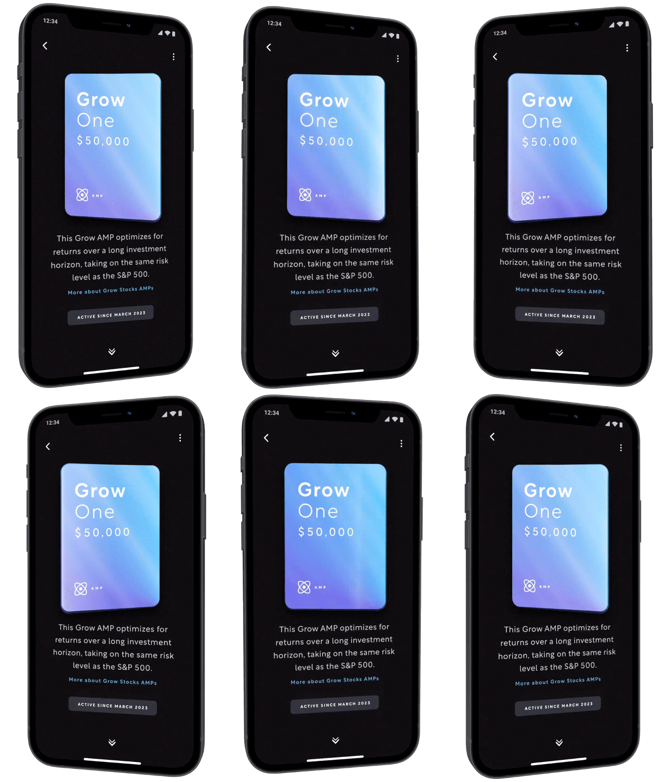


Scroll the full Screen
Scan the QR code above to view a basic Figma prototype of the Grow One investment archetype for the 'feel' and a true sense of scale on your own device. Reach out in the footer if you're interested in a production demo.
Scroll to navigate the full sample archetype
Tap on inline CTAs to dive in to deeper detailed views

sample the investment card
Scan the QR code above to view a prototype of the 3D / holographic treatment proposed for cards in Protopie.
Tilt your device to view the 3D/holographic effect
Tap and Drag the card to see elastic constraints
Tap and Hold on the bottom of the screen to toggle between a sample Investment / Cash card
*Note: Protopie mobile app is required to see how the card interacts with your device's accelerometer.


The archetype detailed above uses the 'Grow One' AI-Managed Portfolio as a showcase from a snapshot in Arta's product arc – the MVP was mobile-only and far leaner but the foundational structure was flexible enough to grow into the rich, robust, mobile & desktop experience above with minimal refactoring.
As our backend infrastructure, market data sources, custodian integrations, and behavioral insights from users evolved, the modular approach let us slot in new content and refine existing modules seamlessly. The product matured naturally alongside our earliest users trusting investments.


Fidelity of Reporting
As engineering and financial research surfaced richer, higher-fidelity data, the feed-like structure of each investment screen helped new modules slot in seamlessly with trivial changes to the existing front-end.
User Segmentation
As we learned more about our user cohorts, the architecture allowed us to conditionally inject personalized, educational, or cross-sell modules that targeted individual investments or an entire asset class.
Experimentation
We didn't get far enough along the growth journey to run active tests on my watch, but the modular framework allowed engineering to build A/B testing functionality into investment views ahead of when we'd need it.
REFLECTIONS
Shaping the investment archetype started with MVP functionality across a broad range of vehicles. Like much of what I built at Arta, I had the luxury of designing ahead of the engineering roadmap – giving me time to think through data fidelity and build a flexible interaction and visual language to tie it all together.
WINS
+ The design was comprehensive, modular, and scalable establishing the engineering roadmap across investment vehicles for nearly a year of back-end work
+ In-house investment class experts effectively audited 'best-in-class' Private Banking solutions and helped us build a strong challenger
+ Users took notice. Our Member Success team regularly hears how the interface helps members understand their investment journey unlike anything they've seen.
FAILS
– Interface is predominantly designed to simplify 'read-only' content and introduced some challenges for investments that featured more options and actions
– Desktop ended up largely a scaled port rather than a true native experience, preserving vertical hierarchy but underutilizing the real-estate
DIFFICULTY
The initial design required going deep with each investment class expert at Arta to understand the investments, their quirks, investor expectations, and data/compliance constraints.
The content is dense and requires a strong and opinionated visual system and heirarchy.
Ongoing ownership was equally demanding — each module required frequent production iteration as data fidelity improved and feature complexity grew.