matt johnson

google wallet 日本
Tactical Localization
scroll to see more

Product
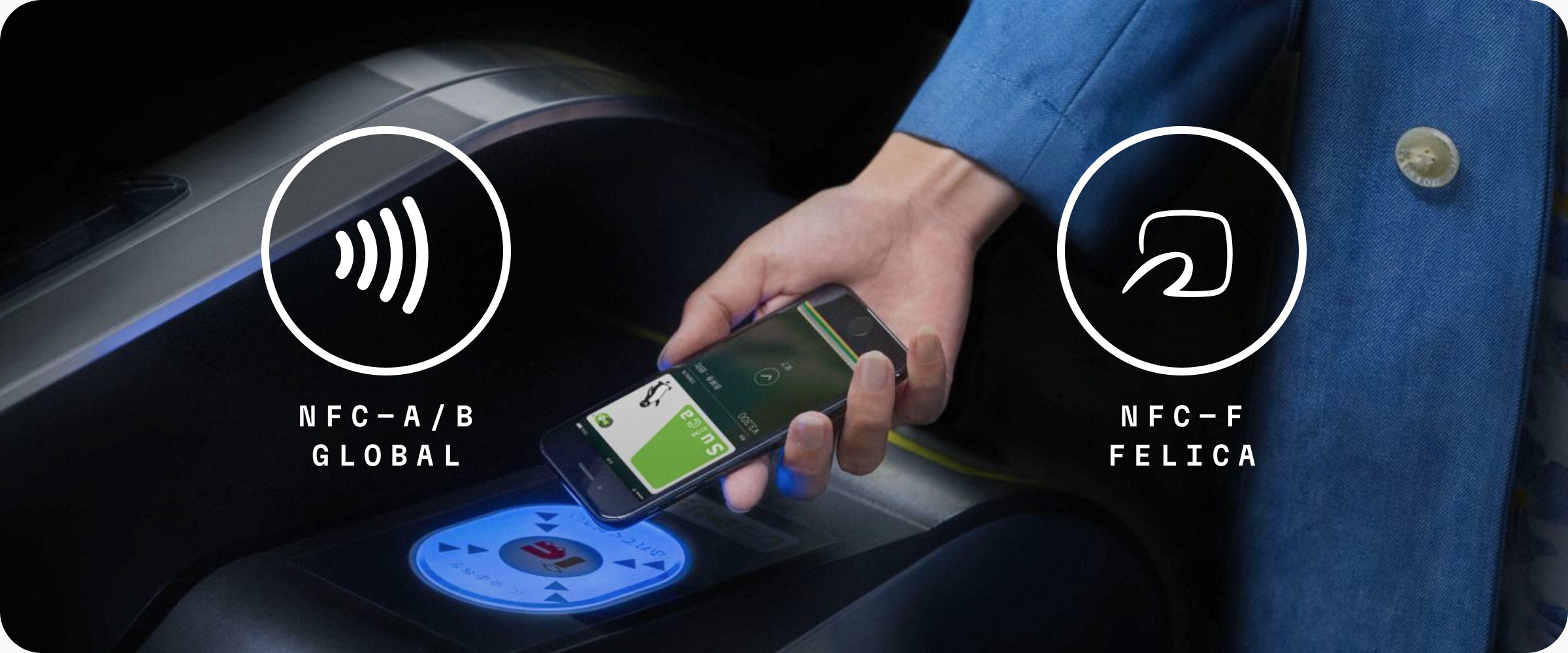
Google Wallet is Android's platform for contactless payments and stored credentials (rewards cards, IDs, tickets, and more). While the world standardized on NFC-A/B for contactless payments, Japan developed its own NFC-F standard (invented in 1988) prized for its speed and reliability — and still dominant in the market today.
Living and working in Japan as Google Pay's global UX lead, I drove the effort to ensure the next major Wallet platform update wouldn't overlook Japan's technical distinctions, and would be better positioned against Apple's native solution in one of the world's most demanding mobile markets.
Opportunity
Japan is one of the world's most NFC-saturated markets — with more contactless-enabled terminals per capita than almost anywhere on earth. Getting Google Wallet right here wasn't just a technical challenge — it was a high-stakes opportunity to establish Google's presence in a market where the bar for speed, reliability, and native-feel is exceptionally high.
CONTRIBUTIONS
Designed a solution that minimized engineering lift and code delta while optimizing the experience for Japan's unique contactless payment behaviors
Championed the user need to leadership, influencing Google Wallet's roadmap and the front-end investment required to better accommodate Japan's NFC-F standard
Partnered with local Payments and Android engineering teams to support early implementation
BIG TAKEAWAY
Great products don't fight technical constraints – they make them invisible.
DetAils
Company
:
Role
:
Market UX Lead
Timeframe
:
2021 Q3 – 2021 Q4
Google Wallet's landing experience is a card carousel that affords simple, artwork-forward navigation of a user's digital wallet and intuitive override of the card used for a given transaction — an elegant solution for NFC-A/B, where the card in focus reliably maps to what's transmitted.
NFC-F breaks this model in two ways:
Exchange Protocol | Multi-Tenancy |
|---|---|
NFC-A/B’s model requires a ‘processing’ handshake between reader and device while NFC-F, developed by Sony for Japan's transit infrastructure, allows a reader to simply ‘scoop up’ a steady-state payload from a nearby device completing the same transaction 2X faster — but requiring payment behavior to be configured at the OS level before a transaction is attempted, not at tap time. | Unlike NFC-A/B’s single-serve payload, NFC-F uses segmented service codes allowing multiple payment methods across transit, retail, and loyalty to be active simultaneously. |
A carousel swipe can't reliably influence what gets transmitted. | A single card in focus doesn't communicate that reality. |
The challenge was proposing an interaction model that was (a) easy to maintain as a market-specific front-end fork, (b) still supported NFC-A/B elegantly, while (c) preserving the simplicity and artwork-forward feel of the existing experience.


Google Wallet supports 8 major classes of valuables, each with unique functionality, availability states, and metadata. While the global revamp designed archetypal UX patterns for each, I validated the full solution against Japanese market requirements — ensuring it scaled elegantly across four dimensions:
Valuable Archetype | Postpaid, Prepaid, Stored Balance, Transit, Loyalty, Passes, Keys, and Credentials |
|---|---|
Valuable State | Default, active, tokenized, suspended, low balance, enhanced w/ partner or data integrations, etc. |
Wallet State | Are there other valuables on device? Are there multiple of the same type? |
Enhanced Functionality | Valuables with more complex partner-integrated functionality such as balance management, integrated loyalty tracking/redemption, inline support, etc. |

Using proprietary transaction & location data inference, Google Wallet has long been able to provide more fidelity on e-money transactions than provider experiences. This nearly ‘automatic’ feature has been a long-coveted advantage for Japanese users who use e-money for both transit and retail purchases.
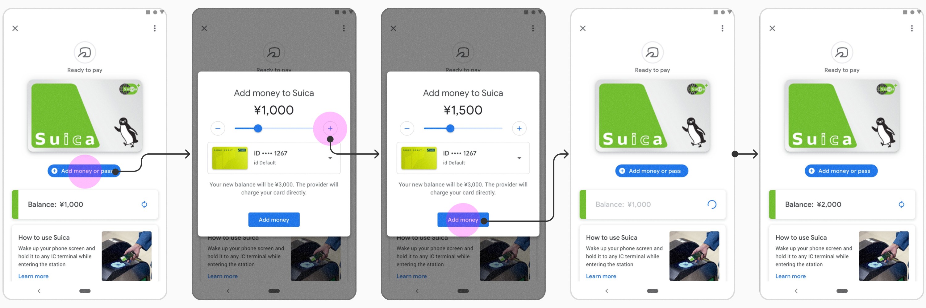
While already firming up UX patterns for e-money valuables, I leaned into this advantage and proposed targeted but high-impact design improvements that would better visualize spending beyond the basic chronological list inherited from standard Google Wallet patterns. My focus was on the following 3 objectives:
Present a more visual / insightful mechanism for users in illuminating common and outlying patterns in their spending
Help users more easily attribute their top-ups/spending between transit and retail usage
Provide a cleaner in-app Auto-load experience with proactive balance notifications

more from Google Wallet
want a demo or
deeper dive?
Hit me up for a demo or a more nuanced discussion about my work.